Interactive Product Tours That Don’t Annoy Users: A UX Playbook
Interactive product tours can accelerate activation—or get dismissed in seconds. This UX playbook shows when tours work, how to keep steps tight, where to anchor tooltips, and how to pair tours with checklists and quick wins. Includes a practical testing checklist to improve completion and reduce drop-offs over time.

Product tours have a reputation problem. Users expect a forced, click-next slideshow that blocks the UI and explains obvious things. But interactive tours can still be one of the fastest ways to move a new user from “I signed up” to “I got value”—if you design them like UX, not like a presentation.
This playbook focuses on practical decisions: when to use a tour, how to structure steps, where to anchor guidance, how to pair tours with checklists and quick wins, and how to test your way to higher completion and lower drop-offs.
What a “non-annoying” product tour actually is
A helpful tour is:
- User-initiated or well-timed, not auto-playing the moment someone lands.
- Interactive, meaning it asks the user to do the real action (click, select, create), not just read.
- Contextual, anchored to the exact UI element needed in that moment.
- Skippable, with a clear exit and a way to resume later.
- Short, focused on a single outcome tied to activation.
A tour becomes annoying when it’s:
- A generic walkthrough of every menu item.
- Modal-heavy and blocking the interface.
- Not relevant to the user’s role, plan, or use case.
- Unclear about why the user should care.
When product tours work best (and when they don’t)
Tours are most effective when they reduce uncertainty in a high-friction moment.
Use tours for these scenarios
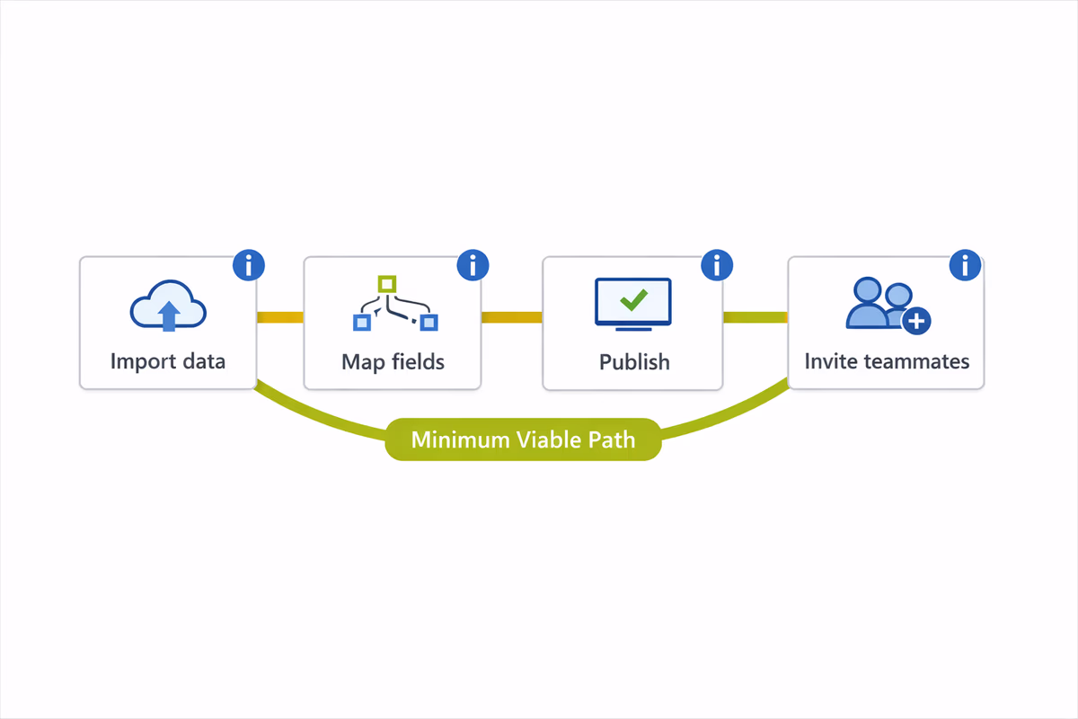
1) New workflows with multiple steps
If value requires a sequence (import data → map fields → publish → invite teammates), a tour can guide the user through the minimum viable path.
2) High-complexity UI
Powerful B2B SaaS tools often have dense screens. A tour can highlight the two or three controls that matter for the first win.
3) Setup tasks that block value
If users must connect an integration, configure permissions, or create their first project before anything works, tours can remove “what do I do next?” friction.
4) Feature discovery after onboarding
Tours aren’t only for day one. Use them when a user becomes eligible for a feature (e.g., after they create their first dashboard, show a tour for sharing and scheduling).
Avoid tours in these scenarios
- The UI is self-explanatory and the “tour” would restate labels.
- The user’s goal is unknown and you can’t segment (a tour will be wrong for most people).
- The user is in the middle of urgent work (supporting a live customer, resolving an incident). Use passive help patterns instead.
Start with one job-to-be-done (not a product map)
The most common mistake: building a tour that tries to “introduce the product.” Users don’t want introductions. They want progress.
Define your tour around a single job:
- “Create your first project and invite one teammate.”
- “Connect your CRM and sync contacts.”
- “Publish your first report.”
Then decide what “done” means in product terms (the event or state). Your tour should end right after the user achieves that outcome.
Keep steps tight: the 3–6 step rule
Most teams ship tours with 10–15 steps because they’re trying to be thorough. Thorough is expensive.
Aim for 3–6 steps. If you need more, you likely need:
- A checklist (multiple tasks, not one tour).
- Branching by persona/use case.
- A second tour triggered later (progressive disclosure).
A practical way to cut steps
For each step, ask:
- Does this step change what the user can do next?
- Would a first-time user fail without it?
- Can the UI itself teach this through labels/defaults?
If the answer is “no,” remove it.
Write copy like micro-instructions
Good tour copy is not marketing. It’s an instruction plus a reason.
- Weak: “This is the Dashboard.”
- Better: “Pin your top KPI here so you can check performance in one glance.”
Keep it to one sentence when possible. If you need a paragraph, the UI is probably too complex for a tooltip.
Tooltip anchoring: where (and where not) to attach guidance
Anchoring is a UX decision, not a styling preference. The goal is to reduce eye movement and ambiguity.
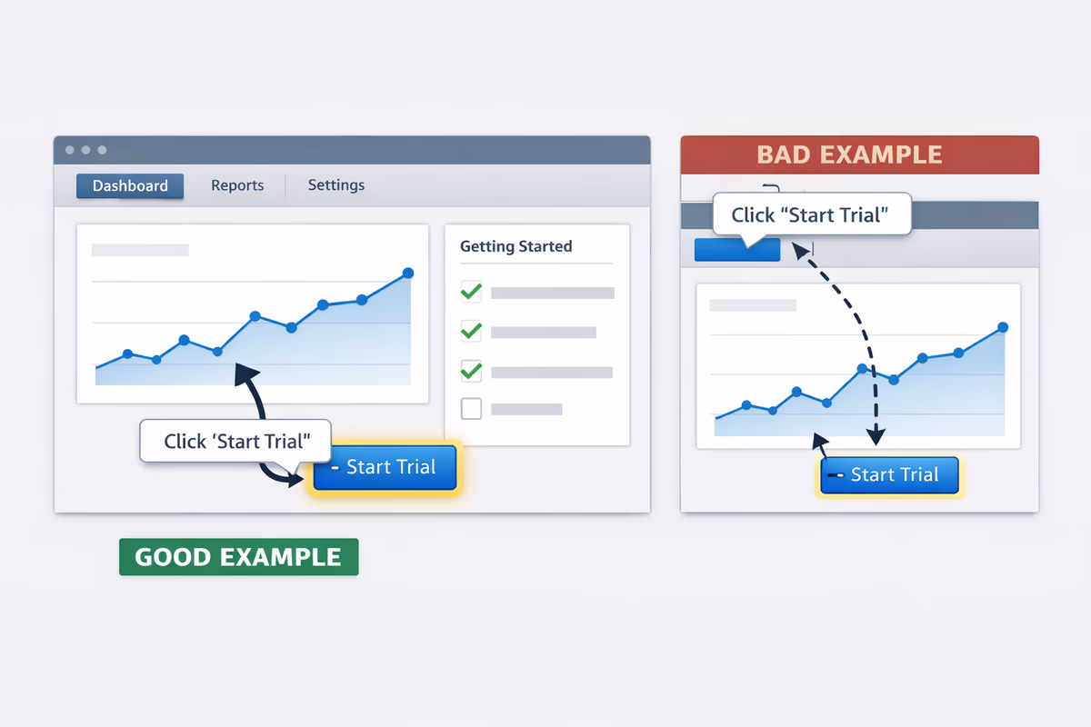
Anchor to the control that completes the step
If the user must click “Create project,” anchor to that button—not the page header.
Avoid anchoring to elements that move or disappear
Common offenders:
- Table rows that reorder on refresh
- Elements behind lazy-loaded content
- Dropdown items that only exist after a click
If the element isn’t reliably present, the tour will break and users will churn from the experience.
Prefer edge-of-screen placements for persistent navigation
If you’re guiding navigation (e.g., “Go to Settings”), anchor to the nav item and position the tooltip so it doesn’t cover the label.
Don’t cover the target
A tooltip that hides the button it’s pointing to forces extra cognitive work. Keep the target visible and clickable.
Use spotlighting sparingly
Spotlight overlays can be effective for focus, but they can also feel like a takeover. Use them only when the screen is visually dense and users consistently miss the target.
Make it interactive: require the real action
If your tour says “Click Next” five times, it’s not teaching behavior.
Design steps so the user must perform the action:
- Select a template
- Add a teammate
- Connect an integration
- Create the first item
Then confirm completion automatically and move forward.
Two rules:
- Never trap the user. Provide “Skip” and “Exit” on every step.
- Always recover from mistakes. If the user clicks elsewhere, don’t restart the tour. Re-anchor or offer “Resume.”
Pair tours with checklists and quick wins
Tours are best for a single path. Checklists are better for multiple tasks.
Use a checklist as the onboarding backbone
A checklist:
- Shows progress (reduces overwhelm)
- Gives users control (they can choose the next task)
- Lets you mix guidance patterns (tours, tooltips, empty states, docs)
Put the tour as one checklist item: “Set up your first workspace (3 min).”
Build quick wins into the tour
A quick win is a visible payoff within minutes:
- Seeing data populate
- Getting a confirmation email
- Sharing a link successfully
- Viewing a first report/dashboard
If your tour ends with “You’re all set!” but the user still hasn’t seen value, expect drop-offs.
Add “Do this later” options for heavy steps
For steps like integrations or permissions, offer alternate paths:
- “Skip for now (use sample data)”
- “Invite teammates later”
This protects time-to-value while still keeping setup discoverable.
Timing and targeting: stop showing tours to the wrong users
A tour that’s perfect for a first-time admin is annoying for a returning power user.
Trigger tours based on intent signals
Better triggers than “on first login”:
- User visits a relevant page for the first time
- User clicks “Create” but abandons
- User reaches a prerequisite state (e.g., created first project)
Segment by role and use case
At minimum, segment by:
- Role (admin vs member)
- Plan (trial vs paid)
- Use case selection (if you collect it)
Then adjust the tour goal accordingly.
Frequency caps and re-entry
- Show an auto-prompt once, then rely on an in-app launcher (“Take the tour”).
- Allow users to resume where they left off.
Measure what matters: completion is not the goal
Tour completion is a diagnostic metric. The real metric is activation behavior.
Track:
- Tour start rate (are users opting in?)
- Step-by-step drop-off (where confusion happens)
- Time to complete (is it too long?)
- Post-tour activation rate (did they do the thing?)
- Time-to-value (did you shorten it?)
If completion is high but activation doesn’t move, the tour is entertaining—not effective.
Testing checklist: improve completion and reduce drop-offs over time
Use this as a recurring QA + optimization pass.
UX and reliability checks
- Every step has Skip and Exit.
- The tour works on common screen sizes (laptop, smaller monitors).
- Steps don’t break with empty states, loading states, or permission differences.
- Anchors attach to stable elements (no flicker, no misalignment).
- The tour doesn’t block critical UI (especially the target control).
Content and flow checks
- The tour has one goal tied to an activation event.
- Steps are 3–6, with no “this is…” filler.
- Each step answers: what to do + why it matters.
- You end on a quick win (visible payoff).
Targeting checks
- The tour is segmented (role/use case at minimum).
- The trigger is based on intent, not just first session.
- Frequency is capped, with a clear way to restart later.
Experiment ideas (simple but high impact)
- Replace an auto-launch with a checklist item + “Start tour” button.
- Split one long tour into two: “First win” now, “Advanced setup” later.
- A/B test first step copy: instruction-only vs instruction + benefit.
- Add a “Use sample data” branch to reduce setup friction.
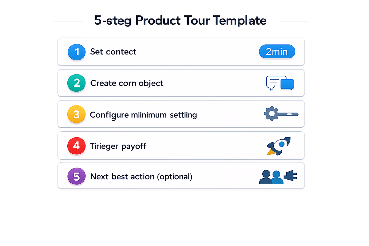
A simple template you can copy
Use this structure for most B2B SaaS tours:
- Set context: “Let’s create your first [object] so you can [benefit]. (2 min)”
- Create the core object (interactive)
- Configure the minimum required setting (interactive)
- Trigger the payoff: generate/share/publish/run
- Next best action: “Want to go further? Add teammates / connect integration” (optional)
If you can’t fit your tour into this template, it’s probably multiple jobs and should become a checklist.
Final rule: respect the user’s momentum
The best tours feel like a helpful colleague standing next to you, pointing at the exact control you need, then getting out of the way.
Design for momentum: short, contextual, interactive, and measurable. That’s how interactive product tours stop being something users close instantly—and start becoming a repeatable lever for activation.
FAQ
How long should an interactive product tour be?
Aim for 3–6 steps focused on one outcome (an activation event). If you need more than that, split the flow into multiple tours triggered later or use an onboarding checklist to cover multiple tasks without forcing a single linear walkthrough.
Should product tours auto-start on first login?
Usually no. Auto-starting often interrupts intent and increases dismissals. A better approach is to trigger tours based on intent signals (first visit to a relevant page, repeated hesitation, reaching a prerequisite state) and provide an obvious “Start tour” launcher or checklist item.
What’s the best way to reduce tour drop-offs?
Reduce steps, make each step interactive, anchor tooltips to stable UI elements, and end with a quick win. Then analyze step-by-step drop-off to find where users get stuck and iterate on copy, anchoring, or segmentation for that specific step.
How do I know if a product tour is actually working?
Don’t rely on completion rate alone. Measure post-tour activation (did users perform the key action), time-to-value, and downstream behaviors like feature adoption or trial conversion. A tour that completes well but doesn’t move activation is teaching the wrong thing.
Table of Contents
- What a “non-annoying” product tour actually is
- When product tours work best (and when they don’t)
- Use tours for these scenarios
- Avoid tours in these scenarios
- Start with one job-to-be-done (not a product map)
- Keep steps tight: the 3–6 step rule
- A practical way to cut steps
- Write copy like micro-instructions
- Tooltip anchoring: where (and where not) to attach guidance
- Anchor to the control that completes the step
- Avoid anchoring to elements that move or disappear
- Prefer edge-of-screen placements for persistent navigation
- Don’t cover the target
- Use spotlighting sparingly
- Make it interactive: require the real action
- Pair tours with checklists and quick wins
- Use a checklist as the onboarding backbone
- Build quick wins into the tour
- Add “Do this later” options for heavy steps
- Timing and targeting: stop showing tours to the wrong users
- Trigger tours based on intent signals
- Segment by role and use case
- Frequency caps and re-entry
- Measure what matters: completion is not the goal
- Testing checklist: improve completion and reduce drop-offs over time
- UX and reliability checks
- Content and flow checks
- Targeting checks
- Experiment ideas (simple but high impact)
- A simple template you can copy
- Final rule: respect the user’s momentum