Onboarding Analytics Pitfalls: 15 Mistakes That Make Data Useless
If your onboarding metrics create debate instead of clarity, the problem is usually your tracking foundation—not your dashboard. Here are 15 common onboarding analytics mistakes (from vague event definitions to mixing user and account metrics) plus the consequence and a practical fix for each, so you can build funnels your team trusts and find real friction fast.

Onboarding analytics should answer simple questions: Where do users get stuck? What behaviors predict activation? Which segments need different guidance?
But most teams collect plenty of onboarding data and still can’t make decisions. The data is noisy, inconsistent, and optimized for “tracking everything” instead of measuring outcomes.
Below are 15 onboarding analytics pitfalls that make data useless—plus the consequence and the fix. Use this as a foundation to build funnels that reveal friction, dashboards your team trusts, and experiments that don’t produce false wins.
First, define what onboarding analytics must do
Before you instrument anything, align on three things:
- Activation definition: the smallest set of actions that indicates a user got real value.
- Onboarding path: the critical steps users must complete to reach activation.
- Segments that matter: role, use case, plan, company size, acquisition channel—whatever changes the onboarding journey.
If you can’t state these in one paragraph, your analytics will become a pile of events.
15 onboarding analytics pitfalls (and how to fix them)
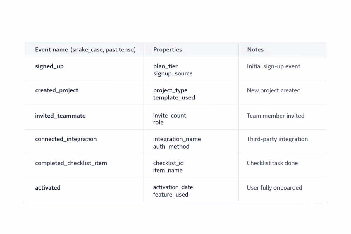
1) Tracking events without written definitions
Consequence: “Created project” means different things to product, engineering, and CS. Funnels become arguments.
Fix: Maintain a tracking plan with:
- Event name
- Trigger condition (exact UI/action)
- Properties (plan, role, workspaceId, etc.)
- Expected volume and edge cases
2) Inconsistent naming conventions
Consequence: You end up with Project Created, project_create, createdProject, and no one trusts totals.
Fix: Choose one convention (e.g., snake_case), one tense (past tense is common), and one taxonomy:
onboarding_step_completedworkspace_invited_memberintegration_connected
3) Measuring clicks instead of outcomes
Consequence: You celebrate “tour started” or “tooltip clicked,” but activation and retention don’t move.
Fix: Track outcomes, not UI interactions. For onboarding, outcomes look like:
data_import_completedfirst_report_createdfirst_teammate_invitedautomation_enabled
Clicks can be useful diagnostics, but they’re not the KPI.
4) Not distinguishing user vs. account/workspace metrics
Consequence: You think onboarding improved because more “accounts activated,” but it’s just one power user doing everything.
Fix: Define metrics at the right level:
- User-level activation (did this user reach value?)
- Account-level activation (did the team/workspace reach value?)
Track both, but don’t mix them in one chart.
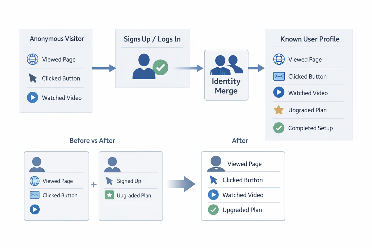
5) Missing identity resolution (anonymous → known)
Consequence: Your funnel starts at signup, but half the pre-signup behaviors disappear once users create an account.
Fix: Ensure your analytics tool merges identities when a user signs up/logs in. Validate with a test: do pre-signup events appear on the same user profile after signup?
6) No timestamp discipline (time zones, backfills, delayed events)
Consequence: Time-to-value looks worse (or better) than reality. Cohorts don’t line up.
Fix: Standardize:
- Use server-side timestamps for critical events
- Store client timestamp separately if needed
- Document backfill behavior and mark imported events
7) Tracking only the “happy path”
Consequence: Funnels look clean, but real users hit errors, permission issues, and dead ends that never show up.
Fix: Track failure states and blockers:
integration_connect_failed(with error code)permission_deniedimport_validation_failedinvite_bounced
If you don’t track friction, you can’t remove it.
8) Over-instrumentation that creates noise
Consequence: Thousands of events, none actionable. Dashboards become slow and unreadable.
Fix: Prioritize events tied to onboarding outcomes. A practical rule: if an event won’t be used in a funnel, segmentation, or experiment readout in the next 60 days, don’t ship it yet.
9) No segmentation, only averages
Consequence: The average onboarding funnel hides the truth. One segment improves; another collapses.
Fix: Bake segmentation into every onboarding view:
- Role (admin vs. member)
- Use case (self-serve vs. sales-led)
- Company size
- Acquisition channel
- Plan (trial vs. freemium)
If a step has different meaning by segment, it needs different onboarding.
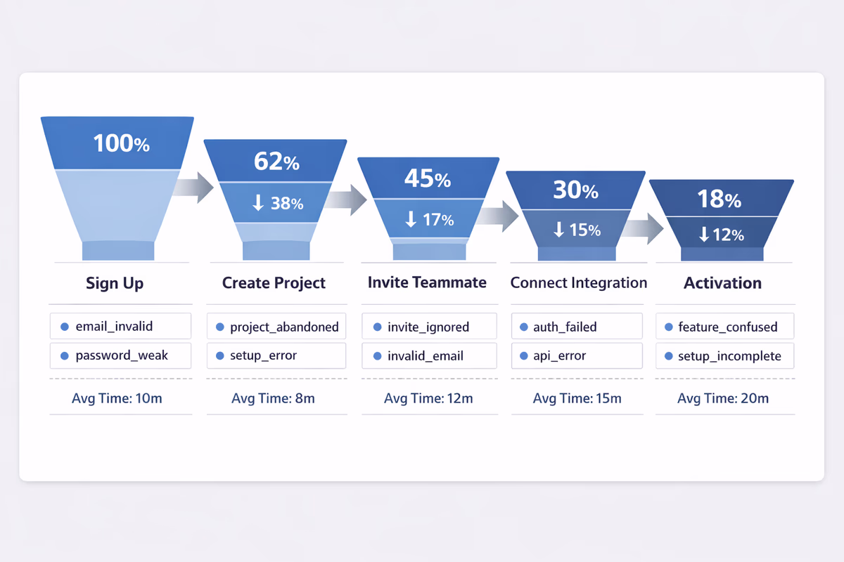
10) Funnels built on the wrong starting point
Consequence: You start the funnel at “visited onboarding page” and ignore users who skip it (or never see it).
Fix: Start where intent begins. Common onboarding funnel starts:
signup_completedfirst_loginworkspace_created
Then measure completion of the activation-critical steps.
11) Unclear conversion windows
Consequence: One dashboard uses 7 days, another uses 30 days, and the team debates whether onboarding “worked.”
Fix: Standardize windows:
- Activation within 1 day (first-session effectiveness)
- Activation within 7 days (onboarding effectiveness)
- Activation within trial length (trial conversion context)
Report all three if needed, but label them clearly.
12) Ignoring time-to-value (TTV)
Consequence: Activation rate looks fine, but users take 10 days to get value and churn before expansion.
Fix: Track TTV as a distribution, not just an average:
- Median time from
signup_completed→activation_event - 75th percentile (where most friction hides)
Then investigate which steps inflate TTV.
13) Counting “step completion” without verifying real completion
Consequence: Users are marked as done because they opened a modal or saw a checklist item, not because they finished the task.
Fix: Use verifiable completion events tied to system state:
- Checklist item “Connect integration” completes only when
integration_connectedfires - “Import data” completes only when
import_completedand records > 0
14) Dashboards that don’t match how teams make decisions
Consequence: Dashboards become a reporting artifact, not an operating tool. People export to spreadsheets and reinvent definitions.
Fix: Build dashboards around decisions:
- Onboarding health: activation rate, TTV, key step drop-offs
- Friction watchlist: error events, permission issues, stuck states
- Segment comparisons: top 3 segments, side-by-side
- Experiment readouts: pre/post with confidence notes
Keep it small. If it’s not checked weekly, it’s not a dashboard—it’s clutter.
15) Declaring wins without guardrails (false positives)
Consequence: You ship an onboarding change that increases a proxy metric (like “tour completed”) but decreases retention or trial conversion.
Fix: Add guardrails to every onboarding experiment:
- Primary: activation rate or TTV improvement
- Secondary: key step completion
- Guardrails: trial-to-paid conversion, early retention (D7/D14), support tickets
If guardrails move the wrong way, treat it as a loss—even if the proxy improved.
How to build an onboarding funnel your team trusts
Use this simple structure:
- Entry event:
signup_completedorfirst_login - Milestone steps (3–7 max): the actions required to reach value
- Activation event: the clearest proof of value
- Time window: 1 day / 7 days / trial duration
- Segments: role, plan, use case, channel
Then add one “diagnostic layer”: for each step, track the top failure events and time between steps.
A practical checklist to fix your foundations in a week
Day 1–2: Align definitions
- Write activation definition (user-level and account-level)
- List the 3–7 onboarding milestones
- Choose your segmentation fields
Day 3–4: Fix tracking plan and naming
- Standardize event names and properties
- Add failure events for critical steps
- Validate identity merge and timestamps
Day 5: Build the dashboard
- One onboarding funnel with drop-offs
- One TTV chart (median + p75)
- One segment comparison view
- One friction watchlist (errors/permission)
Day 6–7: Run a “data trust” review
- Compare dashboard counts to backend/system-of-record where possible
- Spot-check user sessions for event correctness
- Document known gaps and owners
When onboarding analytics is trustworthy, you stop debating numbers and start removing friction.
FAQ
What’s the difference between activation rate and onboarding completion rate?
Onboarding completion rate usually measures finishing a guided flow (checklist, tour, or steps). Activation rate measures reaching a value outcome (e.g., first report created, first integration connected, first successful workflow). Completion can be a leading indicator, but activation is the metric that should anchor onboarding analytics.
How many onboarding events should we track?
Track the smallest set that supports your onboarding funnel and diagnostics: an entry event, 3–7 milestone steps, an activation event, and a handful of failure/blocker events for the critical steps. If an event won’t be used for decisions in the next 60 days, deprioritize it.
Which segments matter most for B2B onboarding analytics?
Start with segments that change the journey: role (admin vs member), plan (trial/freemium/paid), use case, company size, and acquisition channel. Add product-specific segments like industry or integration type if they strongly affect time-to-value.
How do we measure time-to-value correctly?
Choose a consistent start event (often signup completed or first login) and a clear activation event. Report median and 75th percentile time-to-value, then break it down by segment. Avoid relying only on averages, which are easily skewed by outliers.
Table of Contents
- First, define what onboarding analytics must do
- 15 onboarding analytics pitfalls (and how to fix them)
- 1) Tracking events without written definitions
- 2) Inconsistent naming conventions
- 3) Measuring clicks instead of outcomes
- 4) Not distinguishing user vs. account/workspace metrics
- 5) Missing identity resolution (anonymous → known)
- 6) No timestamp discipline (time zones, backfills, delayed events)
- 7) Tracking only the “happy path”
- 8) Over-instrumentation that creates noise
- 9) No segmentation, only averages
- 10) Funnels built on the wrong starting point
- 11) Unclear conversion windows
- 12) Ignoring time-to-value (TTV)
- 13) Counting “step completion” without verifying real completion
- 14) Dashboards that don’t match how teams make decisions
- 15) Declaring wins without guardrails (false positives)
- How to build an onboarding funnel your team trusts
- A practical checklist to fix your foundations in a week
- Day 1–2: Align definitions
- Day 3–4: Fix tracking plan and naming
- Day 5: Build the dashboard
- Day 6–7: Run a “data trust” review