SaaS Onboarding Metrics: 7 Key Metrics That Actually Drive User Activation
Most onboarding dashboards track activity, not activation. These 7 SaaS onboarding metrics help you measure whether users reach their first value moment, pinpoint where they drop off, and improve trial-to-paid conversion with data you can act on.

Teams often say onboarding is “going well” because signups are up, tours are being shown, or users clicked a few buttons.
None of that guarantees activation.
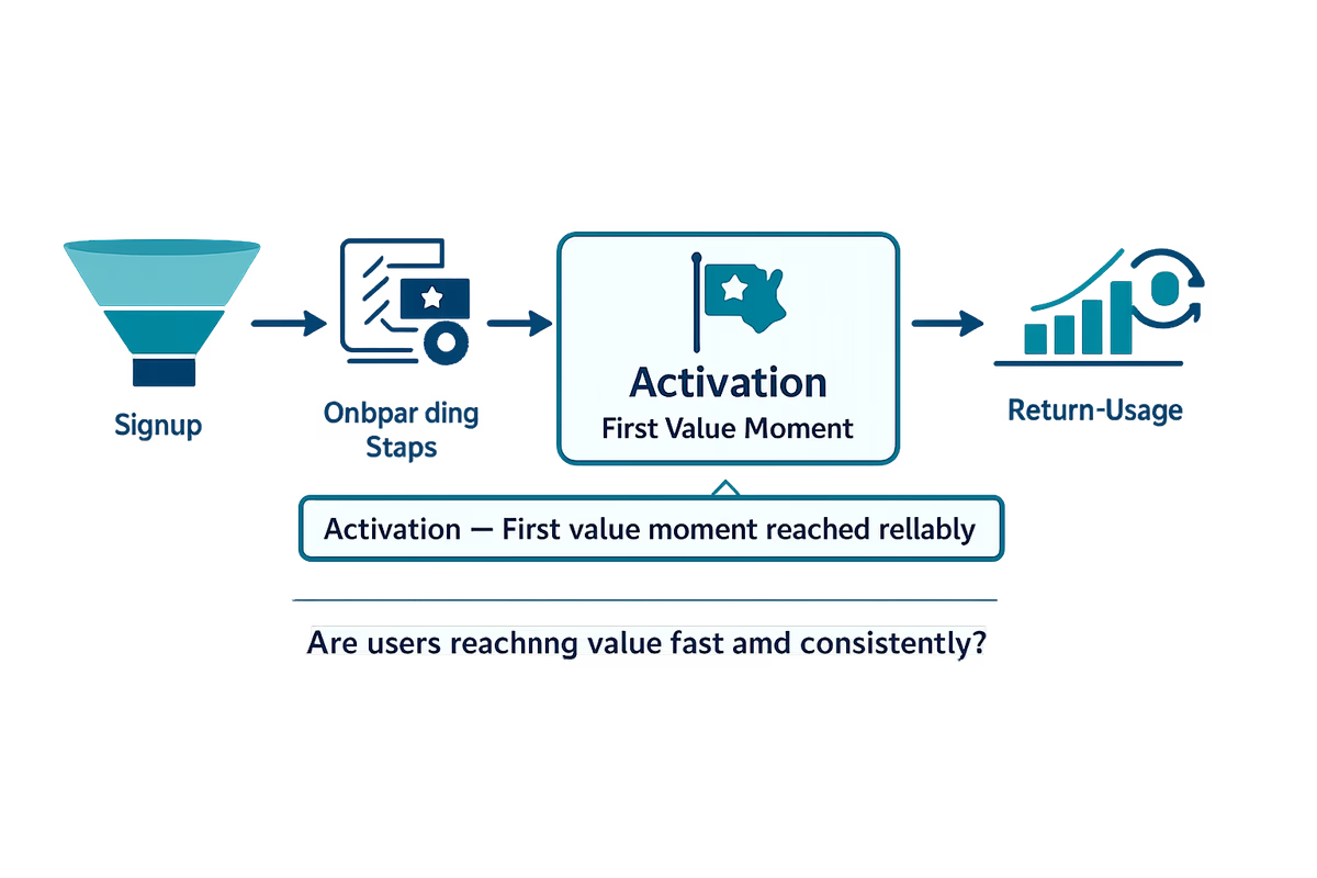
Activation is what happens when a new user reliably reaches a meaningful outcome (their first value moment) and becomes likely to return. Onboarding metrics should answer one question: Are users reaching value fast and consistently?
Below are 7 SaaS onboarding metrics that actually correlate with activation, early retention, and trial-to-paid conversion—plus how to define them, segment them, and improve them.
Before you measure: define activation and the first value moment
If you don’t define activation precisely, you’ll optimize vanity events.
A practical activation definition
Define an activation event as:
- A user action (not a page view)
- That produces a user-visible outcome (not internal setup)
- That can happen early (first session or first few days)
- That predicts retention or conversion
Examples (adjust to your product):
- Project tool: “Created a project + invited 1 teammate”
- Analytics tool: “Connected data source + viewed first dashboard with data”
- Support tool: “Installed widget + received first conversation”
Instrumentation basics (so metrics don’t lie)
Make sure you can track:
- Signup/start date and first session timestamp
- Key onboarding steps as events (e.g., connected integration, created workspace)
- Activation event timestamp
- Plan type (trial vs freemium), acquisition channel, persona/role, company size
Then measure every metric below by segment, not just overall.
1) Activation rate (the metric that keeps onboarding honest)
What it tells you: The percentage of new users who reach your activation event within a defined window.
How to calculate:
- Activation rate = Activated users / New users
- Use a time window: “within 1 day,” “within 7 days,” or “within trial period”
How to use it:
- Break down by persona (admin vs end user), channel, and company size.
- Compare cohorts pre/post onboarding changes.
What to improve when it’s low:
- Reduce steps before value (push optional setup later).
- Add guided paths that match the user’s job-to-be-done.
- Make the activation action obvious in the UI (clear CTA, checklist, empty states).
2) Time-to-Value (TTV) to first value moment
What it tells you: How long it takes users to reach value after signup. Faster TTV usually increases activation and reduces early churn.
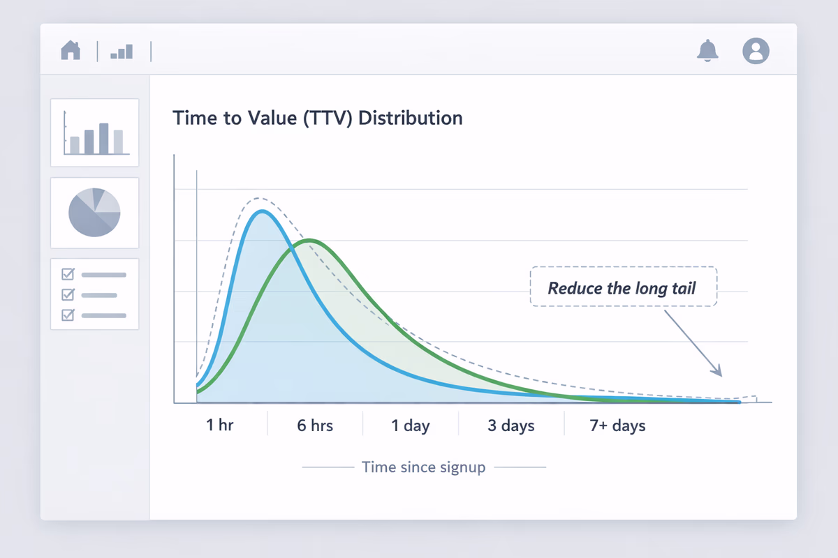
How to calculate:
- TTV = Timestamp(first value event) − Timestamp(signup or first session)
- Track median (not just average) and the 75th/90th percentile.
What “good” looks like: There’s no universal benchmark. What matters is reducing the long tail. A great onboarding experience doesn’t just help power users—it helps the slowest successful users succeed sooner.
What to improve when TTV is high:
- Remove friction in setup (SSO, fewer fields, progressive profiling).
- Provide “quickstart” templates so users can see value without building from scratch.
- Trigger contextual guidance when users stall (e.g., no progress after X minutes).
3) Onboarding step completion rate (per step, not overall)
What it tells you: Which steps are helping users reach activation and which steps are causing drop-off.
How to calculate: For each onboarding step:
- Step completion rate = Users who completed step / Users who saw step
Track this for:
- Checklist items
- Key setup screens
- Critical integrations
- First-run product tours (if you use them)
How to use it:
- Rank steps by completion rate and by correlation to activation.
- Identify “high friction, low impact” steps to remove or postpone.
What to improve when a step underperforms:
- Rewrite the step using outcome language (“Send your first invoice”) instead of feature language (“Create invoice”).
- Add inline examples, defaults, or pre-filled data.
- Split big steps into smaller ones only if it reduces cognitive load (not to inflate completion).
4) Onboarding funnel drop-off (where users abandon the path)
What it tells you: Exactly where users leave the onboarding journey—so you know what to fix first.
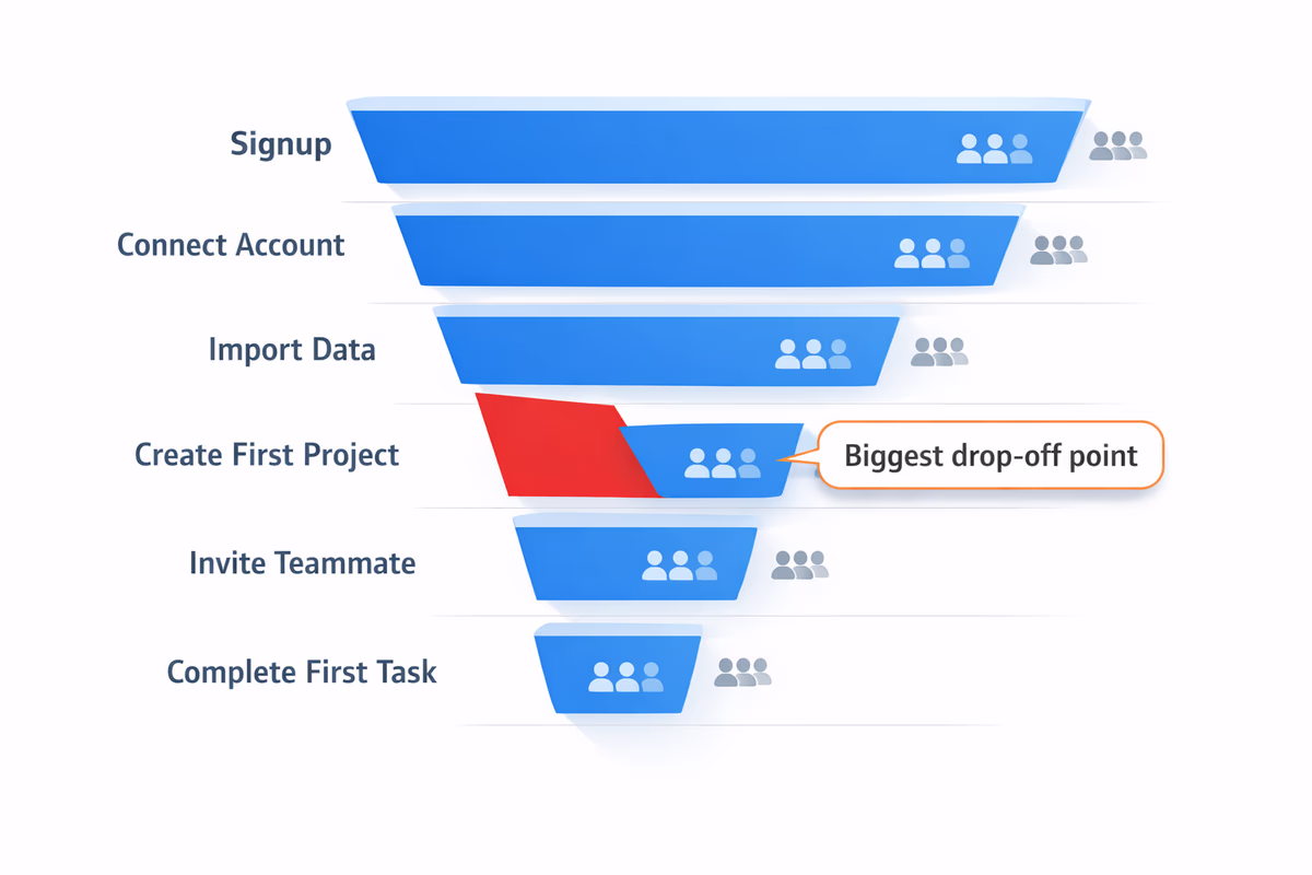
How to calculate: Create a funnel from:
- Signup
- First session started
- Key setup steps (integration, workspace, import)
- Activation event
Then measure:
- Drop-off rate at each stage
- Time between stages
How to use it:
- Look for the “cliff” step where drop-off spikes.
- Segment to see if certain personas drop at different steps (admins vs contributors).
What to improve when drop-off is high at a step:
- If it’s an integration step: offer alternatives (CSV import, sample data mode, sandbox).
- If it’s an “invite teammate” step: allow solo value first, then prompt collaboration later.
- If it’s a configuration step: ship better defaults and fewer decisions.
5) Early retention (Day 1/Day 7 return rate)
What it tells you: Whether onboarding creates habits and repeat usage—not just a one-time activation.
How to calculate:
- Day 1 retention = Users who return 1 day after first session / Users who started first session
- Day 7 retention = Users who return within days 6–8 / Users who started first session
(Adjust windows based on usage frequency. A weekly workflow product should emphasize Week 1/Week 4 retention.)
How to use it:
- Compare retention for activated vs non-activated users.
- Identify whether activation is “real” (predictive) or superficial.
What to improve when early retention is low:
- Add a “next best action” after activation (what should they do tomorrow?).
- Use lifecycle messaging (in-app + email) tied to incomplete steps.
- Make the product’s ongoing value visible (saved time, progress, alerts, results).
6) Trial-to-paid conversion rate (but tied to activation)
What it tells you: Whether onboarding is creating enough value for users to justify paying.
How to calculate:
- Trial conversion rate = Paid accounts / Trial starts
But the more actionable view is segmented:
- Conversion rate for activated users vs non-activated users
- Conversion rate by activation speed (activated in 1 day vs 7 days)
How to use it:
- If activated users convert well but overall conversion is low, your problem is activation volume.
- If activated users still don’t convert, your activation event may not represent real value—or your pricing/packaging is mismatched.
What to improve when conversion lags despite activation:
- Redefine activation to a deeper value event.
- Ensure users experience at least one “aha” output (report, result, collaboration win).
- Add paywall education: show what’s included, why it matters, and when they’ll hit limits.
7) Help-seeking and friction signals (support tickets, searches, rage clicks)
What it tells you: Where users are confused or blocked during onboarding—often before they drop off.
What to track:
- In-app help center searches during onboarding
- “Contact support” clicks
- Chat conversations tagged as onboarding/setup
- Repeated errors (failed integration, permissions issues)
- UX friction signals (repeated clicks, back-and-forth navigation)
How to use it:
- Map help-seeking events to funnel steps.
- Identify the top 3 confusion topics and fix them in-product.
What to improve when friction signals spike:
- Add contextual tooltips or microcopy at the exact point of confusion.
- Add a guided checklist with clear prerequisites (permissions, API keys, admin access).
- Provide role-based routing: if a user can’t complete setup, help them invite the right person.
How to turn these metrics into an onboarding dashboard (that drives action)
A useful onboarding dashboard is not a wall of charts. It should help you decide what to change this week.
Minimum viable onboarding dashboard
Track weekly cohorts and show:
- Activation rate (7-day)
- Median TTV + 90th percentile TTV
- Funnel drop-off by step
- Early retention (Day 1 and Day 7)
- Trial conversion segmented by activation
- Top friction signals mapped to steps
The operating cadence
- Weekly: review cohort movement, pick one bottleneck step, ship one change
- Monthly: revalidate activation definition against retention/conversion
- Quarterly: run a deeper segmentation review (persona, channel, company size)
Common mistakes with SaaS onboarding metrics
Mistake 1: Measuring “tour completion” as success
Tours can help, but completion is not value. Measure whether tour exposure increases activation and reduces TTV.
Mistake 2: Treating all users as one cohort
Admins, champions, and end users behave differently. Your “average” hides your biggest opportunities.
Mistake 3: Optimizing step completion instead of outcomes
A checklist can be gamed. Always connect steps to activation and early retention.
What to do next
If you want onboarding metrics that move activation, start with two decisions:
- Define one activation event that represents real value.
- Build an onboarding funnel that shows exactly how users get there.
Then use the 7 metrics above to find the bottleneck, shorten time-to-value, and increase the share of users who reach value before they churn.
FAQ
What is the difference between onboarding metrics and activation metrics?
Onboarding metrics measure progress through the first-time experience (steps completed, drop-off, time between steps). Activation metrics measure whether users reach a meaningful value outcome (your activation event) and how quickly they get there. Good onboarding metrics should explain changes in activation rate and time-to-value.
How do I choose the right activation event for a B2B SaaS product?
Pick an action that produces a user-visible outcome and happens early (first session to first week). Validate it by checking whether users who complete it retain or convert at a much higher rate than users who don’t. If it doesn’t predict retention or conversion, it’s not a strong activation event.
Which onboarding metric should I improve first?
Start with onboarding funnel drop-off and time-to-value. Drop-off shows where users are getting stuck, and TTV shows how long it takes successful users to reach value. Fixing the biggest drop-off step or reducing the long tail of TTV usually increases activation rate fastest.
What’s a good time-to-value benchmark for SaaS onboarding?
There isn’t a universal benchmark because value frequency differs by product. A practical approach is to track median and 90th percentile TTV, then aim to reduce the 90th percentile over time. That improves outcomes for users who would otherwise churn early.
Table of Contents
- Before you measure: define activation and the first value moment
- A practical activation definition
- Instrumentation basics (so metrics don’t lie)
- 1) Activation rate (the metric that keeps onboarding honest)
- 2) Time-to-Value (TTV) to first value moment
- 3) Onboarding step completion rate (per step, not overall)
- 4) Onboarding funnel drop-off (where users abandon the path)
- 5) Early retention (Day 1/Day 7 return rate)
- 6) Trial-to-paid conversion rate (but tied to activation)
- 7) Help-seeking and friction signals (support tickets, searches, rage clicks)
- How to turn these metrics into an onboarding dashboard (that drives action)
- Minimum viable onboarding dashboard
- The operating cadence
- Common mistakes with SaaS onboarding metrics
- Mistake 1: Measuring “tour completion” as success
- Mistake 2: Treating all users as one cohort
- Mistake 3: Optimizing step completion instead of outcomes
- What to do next